Property View
Many IDEs, such as the traditional Eclipse IDE, have the notion of a global, extensible property view, which shows additional information about the current selection within the IDE. Property views are heavily used in those IDEs for showing details of elements in e.g. diagram editors, complex tree editors, or the file explorer selection. Therefore, the main idea is to have a global, generic property view in the IDE, but allow specific implementations to extend the contents of the global property view with specific additional information for some type of selection.
The @theia/property-view extension contributes a generic, global property view based on Theia's global selection.
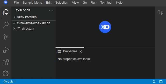
The property view widget can be opened/toggled either via menu View->Properties or via shortcut Shift+Alt+P.
It is located in the bottom dock area by default.
The following two default content widgets are implemented in this extension:
EmptyPropertyViewWidget: If no other widget can be provided, a simple message (No properties available) is shown.ResourcePropertyViewWidget: Displays additional information about a file (e.g. location, name, last modified) that is selected in the file explorer or in the active monaco editor.
Contribute a Custom Property View
To contribute a specific property view, it is necessary to implement a PropertyViewDataService which gathers the property data for a selection
as well as a PropertyViewWidgetProvider which provides a suitable content widget to display the property data for a specific selection inside the property view widget.
Here is a short example of how to implement an additional property view, which displays the name and whether it is a file or directory
in a simple React widget based on the selection from the file explorer (assuming there would be no ResourcePropertyViewWidget of course):
The FileInfoPropertyDataService gathers the file information and delivers a custom object:
custom-data-service.ts:
export interface FileInfoPropertyObject {
    name: string;
    isDirectory: boolean;
}

@injectable()
export class FileInfoPropertyDataService implements PropertyDataService {

    readonly id = 'fileinfo';
    readonly label = 'FileInfoPropertyDataService';

    @inject(LabelProvider) protected readonly labelProvider: LabelProvider;

    canHandleSelection(selection: Object | undefined): number {
        return this.isFileSelection(selection) ? 1 : 0;
    }

    private isFileSelection(selection: Object | undefined): boolean {
        return !!selection && Array.isArray(selection) && FileSelection.is(selection[0]);
    }

    async providePropertyData(selection: Object | undefined): Promise<FileInfoPropertyObject | undefined> {
        if (this.isFileSelection(selection) && Array.isArray(selection)) {
            return {
                name: this.labelProvider.getName(selection[0].fileStat.resource),
                isDirectory: (selection[0].fileStat as FileStat).isDirectory
            };
        }
        return Promise.reject();
    }
}
The FileInfoPropertyWidget is a simple ReactWidget and displays the selected node and whether it is a file or directory:
custom-content-widget.tsx:
export class FileInfoPropertyViewWidget extends ReactWidget implements PropertyViewContentWidget {

    static readonly ID = 'file-info-property-view';
    static readonly LABEL = 'File Information';

    protected currentFileInfo: FileInfoPropertyObject;

    constructor() {
        super();
        this.id = FileInfoPropertyViewWidget.ID;
        this.title.label = FileInfoPropertyViewWidget.LABEL;
        this.title.caption = FileInfoPropertyViewWidget.LABEL;
        this.title.closable = false;
        this.node.tabIndex = 0;
    }

    updatePropertyViewContent(propertyDataService?: PropertyDataService, selection?: Object | undefined): void {
        if (propertyDataService) {
            propertyDataService.providePropertyData(selection).then((fileInfo: FileInfoPropertyObject) => this.currentFileInfo = fileInfo);
        }
        this.update();
    }

    protected render(): React.ReactNode {
        return (<div>
            {`Selected node in explorer: ${this.currentFileInfo.name} ${this.currentFileInfo.isDirectory ? '(Directory)' : '(File)'}`
    }
        </div>);
    }
}
The FileInfoPropertyViewWidgetProvider is responsible to provide the correct PropertyViewContentWidget based on the selection:
custom-widget-provider.ts:
@injectable()
export class FileInfoPropertyViewWidgetProvider extends DefaultPropertyViewWidgetProvider {

    override readonly id = 'fileinfo';
    override readonly label = 'FileInfoPropertyViewWidgetProvider';

    private fileInfoWidget: FileInfoPropertyViewWidget;

    constructor() {
        super();
        this.fileInfoWidget = new FileInfoPropertyViewWidget();
    }

    override canHandle(selection: Object | undefined): number {
        return this.isFileSelection(selection) ? 1 : 0;
    }

    private isFileSelection(selection: Object | undefined): boolean {
        return !!selection && Array.isArray(selection) && FileSelection.is(selection[0]);
    }

    override provideWidget(selection: Object | undefined): Promise<FileInfoPropertyViewWidget> {
        return Promise.resolve(this.fileInfoWidget);
    }

    override updateContentWidget(selection: Object | undefined): void {
        this.getPropertyDataService(selection).then(service => this.fileInfoWidget.updatePropertyViewContent(service, selection));
    }
}
In the frontend module of the application the FileInfoPropertyDataService as well as the FileInfoPropertyViewWidgetProvider are registered as follows:
bind(PropertyDataService).to(FileInfoPropertyDataService).inSingletonScope();
bind(PropertyViewWidgetProvider).to(FileInfoPropertyViewWidgetProvider).inSingletonScope();
Following these few steps should give the reader an idea on how to implement an own property view, consisting of a specific PropertyViewWidgetProvider and PropertyViewDataService.
The resulting property view will be displayed like this: