

Label Provider
A label provider in Eclipse Theia is responsible for the way elements/nodes are presented in the UI. The label provider determines the icon and the text for elements displayed in trees, lists or other locations such as view headers. A good example is the file explorer: file and directory nodes retrieve their icon and text from the label provider. Another example for the usage of a label provider is the header of an open editor. Please also see the LabelProvider TypeDoc.
The default label provider in Theia browses registered label provider contributions to determine the best fitting one for an element/node. The label provider will delegate the calls for a specific node to the contribution which can best handle the element. Eclipse Theia provides default label provider contributions for common types, e.g. for files. By providing your own label provider contributions, you can extend or adapt the look of specific nodes, based on specific criteria.
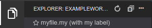
In this article we will describe how to customize the label and icon of a custom file type (.my) in Eclipse Theia, as seen in the screenshot below.
If you are not yet familiar with contribution points in Theia or the use of dependency injection, please consider this guide on Services and Contributions.
All the following code examples are from the Theia extension generator. You can get the same code set-up by installing the generator, selecting the “Label Provider” example (see here) and choosing “labelProvider” as the name.
Contributing a Label Provider
To contribute a custom label provider contribution you provide a LabelProviderContribution, i.e. a class implementing this interface. In this example, instead of directly implementing the interface, we extend the default implementation for files: FileTreeLabelProvider. This allows us to only override the behavior we want to customize.
labelprovider-contribution.ts
@injectable()
export class LabelproviderLabelProviderContribution extends FileTreeLabelProvider
The function canHandle determines whether the label provider contribution is responsible for a specific node (in our example for ".my" files). Therefore, it can check any condition on the respective file, e.g. the file extension. The return value of the function is an integer representing the priority of the label provider contribution, the label provider contribution with the highest priority will be used by the label provider. This way, you can override the default label provider contributions to custom files by returning a higher priority.
The canHandle function receives an object representing the file handed in as a parameter (for the file tree a FileStatNode). Please see an example implementation for canHandle below, which will register a label provider contribution for the file extension “.my”:
labelprovider-contribution.ts
canHandle(element: object): number {
    if (FileStatNode.is(element)) {
        let uri = element.uri;
        if (uri.path.ext === '.my') {
            return super.canHandle(element)+1;
        }
    }
    return 0;
}
Once the label provider contribution is registered for your custom file extension, you can optionally implement getName, getIcon and getLongName. These receive a URI as a parameter and return a custom icon and a custom name for the respective file. Icon and name are used in the file view of Theia. The long name (not customized in the example) is shown as a tooltip when you hover over the file in an opened editor tab. For more details, see the LabelProviderContribution TypeDoc
labelprovider-contribution.ts
getIcon(): string {
    return 'fa fa-star-o';
}

getName(fileStatNode: FileStatNode): string {
    return super.getName(fileStatNode) + ' (with my label)';
}
To make our LabelProviderContribution accessible to Theia, we need to bind the custom LabelProviderLabelProviderContribution to the respective contribution symbol LabelProviderContribution. This is done in the labelprovider-frontend-module, for more details see Services and Contributions.
labelprovider-frontend-module.ts
export default new ContainerModule(bind => {
    // label binding
    bind(LabelProviderContribution).to(LabelProviderLabelProviderContribution);
});
Adding a custom icon via CSS
The getIcon function returns a CSS string identifying an icon for the custom file type. In the example above, we use a Font Awesome icon. If you want to use a custom icon, you need to add this icon to the CSS as well. Usually, there will be multiple versions of an icon depending on the style (dark vs. light). The following example shows how to add a custom icon. To use this in the example, replace the returned string in getIcon above with ‘my-icon’
example.css
.my-icon {
    background-repeat: no-repeat;
    background-size: 12px;
    width: 13px;
    height: 13px;
}
.light-plus .my-icon{
    background-image: url('./custom_icon_black_18dp.png');
}
.dark-plus .my-icon{
    background-image: url('./custom_icon_white_18dp.png');
}