

Enhanced Tab Bar Preview
By default, Theia shows the value of a widget's caption property when users hover above a widget's tab (see also widgets).
In certain use cases, especially with custom editors, this information may however not be sufficient to give users sufficient overview about a widget's content before activating the tab.
Therefore, Theia optionally provides an enhanced tab bar preview for widgets of the main or bottom area of Theia; that is, for horizontal tab bars. This enhanced preview offers more room for information for widgets to show when hovering above a widget's tab. Moreover, it can easily be styled according to the needs of a tool provider adopting Theia.
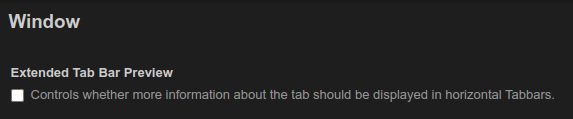
Enabling the enhanced tab bar preview
The enhanced tab bar preview is disabled by default and needs to be explicitly enabled with a via the preference window.tabbar.enhancedPreview.
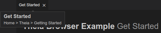
After enabling the enhanced tab bar preview, users will see the following on hovering over a widget's tab:
Specifying the contents of the preview
The values shown in the tab bar preview are taken from the widget's title and caption properties.
These values can thus be easily provided by the widget implementation:
    @postConstruct()
    protected async init(): Promise<void> {
        this.id = GettingStartedWidget.ID;
        this.title.label = GettingStartedWidget.LABEL;
        this.title.caption = 'Home > Theia > Getting Started';
        this.title.closable = true;
Customization of the preview
For custom products, the enhanced tab bar preview can be customized and styled according to the requirements of the respective product. Below we discuss the most relevant customization options.
Styling of the outer element
The styling of the hover box can easily be done with CSS.
If all hovers should be styled (including ones that are unaffected by the window.tabbar.enhancedPreview setting) the .theia-hover CSS class can be adjusted.
To only change the styling of the enhanced tab bar previews, use the CSS selector .theia-hover.extended-tab-preview instead.
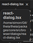
By default, the enhanced tab bar preview for horizontal tab bars has rounded corners. This is defined by adding a border-radius to the .theia-hover.extended-tab-preview CSS class:
.theia-hover.extended-tab-preview {
    border-radius: 10px;
}
Styling of the content element
To style the elements inside of the preview, class names are assigned to the different components of the preview. Those are:
.theia-horizontal-tabBar-hover-div(for the outer box).theia-horizontal-tabBar-hover-title(for the title).theia-horizontal-tabBar-hover-caption(for the caption).
If, for example, the preview should have a fixed size, this can be achieved by specifying a width for the .theia-horizontal-tabBar-hover-div and a max-width to the other two rules.
To also ensure the text is not going over the boxes boundaries, the property word-wrap: break-word can be added to the latter two rules.
.theia-horizontal-tabBar-hover-div {
  margin: 0px 4px;
  width: 100px;
}

.theia-horizontal-tabBar-hover-title {
  font-weight: bolder;
  font-size: medium;
  margin: 0px 0px;
  max-width: 100px;
  word-wrap: break-word
}

.theia-horizontal-tabBar-hover-caption {
  font-size: small;
  margin: 0px 0px;
  margin-top: 4px;
  max-width: 100px;
  word-wrap: break-word
}
After those rules are applied the preview will look as shown below:
Changing the content element
To change the actual content that is being rendered inside of the preview, the TabBarRenderer can be extended to overwrite the renderExtendedTabBarPreview method.
If, for example, the preview should only render the caption, the following CustomTabBarRenderer could be created:
export class CustomTabBarRenderer extends TabBarRenderer {
    protected override renderExtendedTabBarPreview = (title: Title<Widget>) => {
        const hoverBox = document.createElement('div');
        hoverBox.classList.add('theia-horizontal-tabBar-hover-div');
        const labelElement = document.createElement('p');
        labelElement.classList.add('theia-horizontal-tabBar-hover-title');
        labelElement.textContent = title.label;
        hoverBox.append(labelElement);
        return hoverBox;
    };
}
Now, we need to bind our custom TabBarRendererFactory to activate our customization and ensure the preview renders the information as defined in the implementation of CustomTabBarRenderer.renderExtendedTabBarPreview() above.
    bind(TabBarRendererFactory).toFactory(({ container }) => () => {
        const contextMenuRenderer = container.get(ContextMenuRenderer);
        const tabBarDecoratorService = container.get(TabBarDecoratorService);
        const iconThemeService = container.get(IconThemeService);
        const selectionService = container.get(SelectionService);
        const commandService = container.get<CommandService>(CommandService);
        const corePreferences = container.get<CorePreferences>(CorePreferences);
        const hoverService = container.get(HoverService);
        return new CustomTabBarRenderer(contextMenuRenderer, tabBarDecoratorService, iconThemeService, selectionService, commandService, corePreferences, hoverService);
    });